ADD SOME !POP!
So as I've said in previous posts, I am sharing stuff I find as I go and learn. This is a tip I found very useful!
A THICKER SILHOUETTE
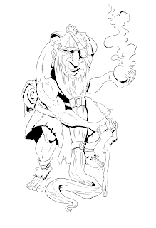
So I while working on this character design for a comic, I was happy with the design but then found that it was not standing out as much as I like when it was inked.
I went thru a few options that usually help in my sketch book when I want something to stand out.
- ADD A COLORED BACKGROUND SHAPE
- ADD SOME LIGHT COLOR ON PARTS
BOTH THESE WORK GREAT IN SKETCHBOOKS
In this instance I wanted the ink to be more self standing. So I tried adding a much thicker outline.
THE INKS BEFOR AN OUTLINE:
THE INKS AFTER THE OUTLINE:
 This made a huge difference in the overall image. I could have gone a bit thicker but I did not want to over do it. I think I will start doing this for every character that I want to stand out.
 So in this instance of course I was doing the inks digitally. Just to show how it works in traditional here is a piece from my sketch book where I did the same thing.
The left is before The right is after
Give it a try! Outlining things is fun. What ever you do keep working, keep improving and have a good time doing it.
-CHAP


Comments
Post a Comment